
Right Logo Style, Every industry has its own visual language. A law firm and a candy shop send very different messages, and their logos should reflect that difference. Choosing the right logo style for your industry helps customers understand what your business does before they read a single word.
This guide walks you through the main logo styles, how they match different industries, and the simple steps you can take to pick a style that fits your brand. By the end, you will have a clear idea of what direction works best for your business.
Table of Contents
Why Logo Style Should Match Your Industry
Customers form quick judgments based on visuals. When a logo style matches industry expectations, it builds instant trust. A serious, minimal logo tells customers a law firm is professional and steady. A playful, colorful logo tells customers a bakery is warm and inviting.
If your logo style clashes with your industry, customers may feel confused or unsure about your brand. A neon, cartoon style logo on a financial firm can seem untrustworthy, even if the service itself is solid. On the other hand, a stiff, formal logo on a children’s toy brand can feel cold and uninviting. Matching your logo style to your industry removes that friction and helps your brand feel like a natural fit.
Main Types of Logo Styles to Know
Right Logo Style, Before you can choose the right style, it helps to understand the main categories designers work with. Each style has its own strengths and typical use cases.
Wordmark
A wordmark spells out your full business name in a custom typeface. It works well when your name is short, catchy, and easy to remember. Wordmarks are common in fashion, media, and personal brands, since the name itself is often the whole identity.
Lettermark
A lettermark uses initials instead of a full name. This style suits businesses with long or complex names, since initials are easier to read at a glance and easier to fit into small spaces like app icons or social media profiles.
Pictorial Mark
A pictorial mark, sometimes called an icon or symbol, uses a simple graphic to represent the brand without any text. This style works best for brands that are already well known, since customers need to recognize the symbol on its own.
Abstract Mark
An abstract mark uses a shape or form that does not represent anything literal but still carries meaning through color and structure. This style is common in tech and sports brands that want a modern, forward looking feel.
Mascot
A mascot logo uses a character or figure to represent the brand. This style works well for businesses that want to feel friendly, fun, or family oriented, such as restaurants, sports teams, or children’s products.
Combination Mark
A combination mark pairs a wordmark or lettermark with a graphic symbol. This is one of the most flexible styles, since it lets a new brand build name recognition and visual recognition at the same time. It works well across almost any industry, especially for startups.
Emblem
An emblem places the business name inside a badge, crest, or shape. This style suggests heritage, authority, and tradition, which makes it a common choice for schools, government offices, and long established brands.
According to VistaPrint’s guide to logo types, each of these seven main styles suits different use cases and business goals, and the right choice often comes down to how and where the logo will be used across print and digital materials.
Matching Logo Styles to Different Industries
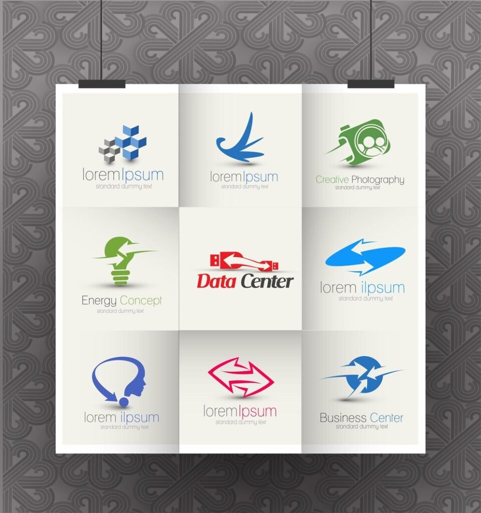
Once you understand the main logo styles, the next step is matching them to your specific industry. Here are some general patterns that tend to work well.
Technology and Startups
Tech companies and startups often lean toward combination marks or abstract marks. These styles feel modern, clean, and flexible, which matches the fast moving nature of the tech industry. A simple, sharp design also scales well across apps, websites, and small icons.
Law and Finance
Law firms and financial companies usually choose wordmarks, lettermarks, or emblems. These styles feel serious, stable, and trustworthy. Serif fonts and deeper colors like navy, black, or burgundy are common choices, since they suggest tradition and reliability.
Food and Beverage
Restaurants, cafes, and food brands often use mascots, pictorial marks, or combination marks. These styles feel warm and approachable. Bright colors and rounded fonts are common in this space, since they create a friendly, appetizing feel.
Fashion and Beauty
Fashion and beauty brands tend to favor wordmarks with elegant, custom typography. This style keeps attention on the brand name itself, which supports a clean, high end feel. Minimal color palettes are common, since simplicity often reads as luxury.
Healthcare
Healthcare brands usually choose combination marks or simple pictorial marks. These styles need to feel calm, clean, and trustworthy. Soft blues and greens are common colors in this space, since they suggest health, care, and safety.
If you want a deeper look at how logo choices shift across markets, our post on top logo design trends every brand should know breaks down current patterns you can use for inspiration.
How Color and Font Choices Support Your Industry
Logo style is only part of the picture. Color and font choices work together with your style to send the right message. Blue often feels trustworthy and calm, which explains why it appears so often in finance and healthcare logos. Warm colors like red and orange can feel energetic and exciting, which works well for food brands and entertainment companies.
Adobe’s guide to color meaning explains that color shapes how people feel about a product and how they interpret its message, which is why color choice deserves the same care as your logo style. Fonts carry a similar weight. Serif fonts often feel traditional and formal, while sans serif fonts feel modern and approachable. Script fonts can add a personal or elegant touch, which works well for boutique or beauty brands.
Steps to Choose the Right Logo Style for Your Business
Choosing a logo style does not need to be complicated. These simple steps can guide your decision.
First, define your brand personality. Ask yourself if your business feels modern, traditional, playful, or serious. This single answer narrows down your style options quickly.
Second, study your industry. Look at logos from businesses similar to yours, both direct competitors and respected leaders in the space. Notice which styles repeat often and think about why they work.
Third, consider your name. A short, catchy name supports a wordmark. A long name may work better as a lettermark or combination mark, so the design stays clean at small sizes.
Fourth, think about where your logo will appear. If most of your marketing happens on social media and apps, choose a style that stays clear at a small size. If you rely more on signage, packaging, or print, you have a bit more room for detail.
Fifth, test different versions. Before finalizing anything, compare a few style options side by side. Show them to people outside your business and ask which one feels most fitting for what you do.
If you want expert guidance through this process, our logo design services team can help you explore different styles and narrow down the right fit for your industry. Many businesses also pair this with full brand identity support, so the logo style connects smoothly with colors, fonts, and messaging across the whole brand.
Mistakes to Avoid When Choosing a Logo Style
A few common mistakes can pull a logo style away from its industry. Following trends blindly, without checking if they fit your business, often leads to a generic look. Choosing a style just because a competitor uses it can also blur your identity instead of strengthening it.
Overcomplicating a design is another common issue. Detailed emblems or intricate mascots can look impressive at full size but lose clarity when shrunk down to a small icon or business card. Simplicity almost always wins in the long run.
Ignoring how the logo will be used is another mistake. A style that looks great on a website banner may not translate well to a favicon or social media profile picture. Testing your logo across different formats early on helps avoid costly redesigns later.
For more practical guidance, check out our tips for creating a memorable logo design, which covers additional ways to keep your design strong and lasting.
Final Thoughts
Right Logo Style, The right logo style helps customers understand your business at a glance, before they read a single word about what you offer. By understanding the main logo styles, studying your industry, and testing your options carefully, you can choose a design that feels natural and builds trust from the very first impression.
If you are ready to move forward, you can review sample pricing packages to see what level of support fits your budget and goals as you build out your brand.
Frequently Asked Questions
What is the best logo style for a startup?
Combination marks work well for most startups. They pair a name with a symbol, which helps build both name recognition and visual recognition at the same time.
Should every business in an industry use the same logo style?
No. While patterns exist, your logo should still feel unique to your brand. The goal is to fit industry expectations while standing out from direct competitors.
Can I change my logo style later as my business grows?
Yes. Many brands refine their logo style over time as they grow and their audience changes. Small, thoughtful updates are common and often help a brand stay current.
Does color matter as much as logo style?
Yes. Color and style work together. The right style paired with the wrong color can send mixed signals, so it is worth planning both at the same time.